HOME | Planning an interior photoshoot
The end result of an interior designer’s photoshoot is hundreds of shiny, carefully curated, beautiful images. The reality is slightly different! I have always admired and known that the work of an interior stylist involves a lot of heavy lifting and logistics but I found out just how hard it is in the photoshoot for my recently completed Paddo Pad project.
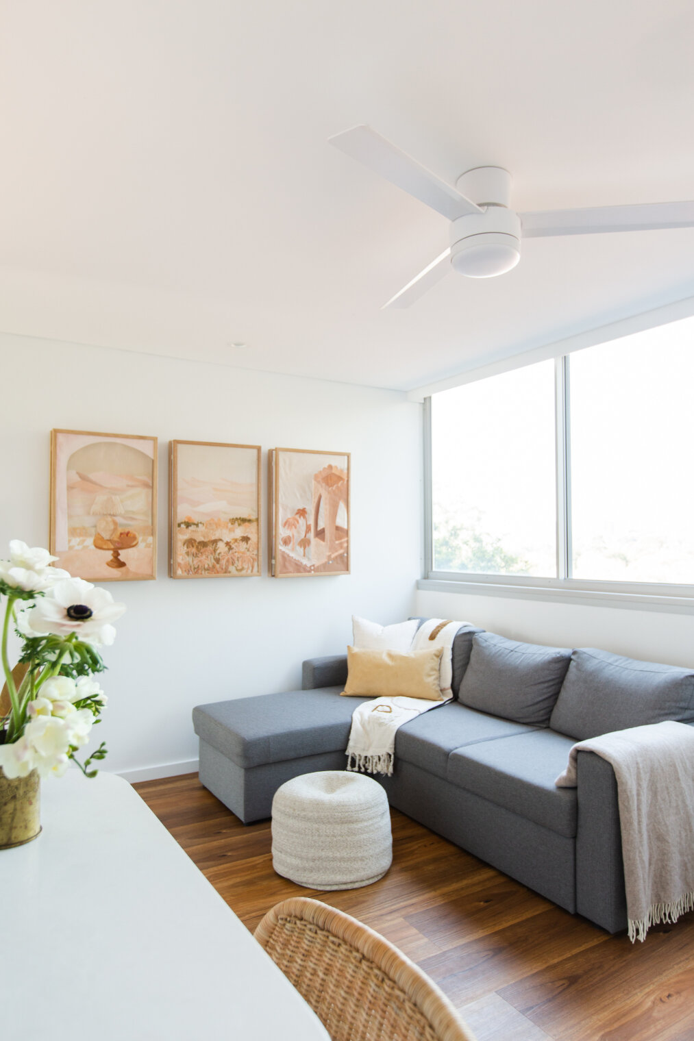
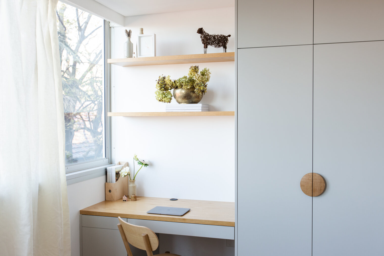
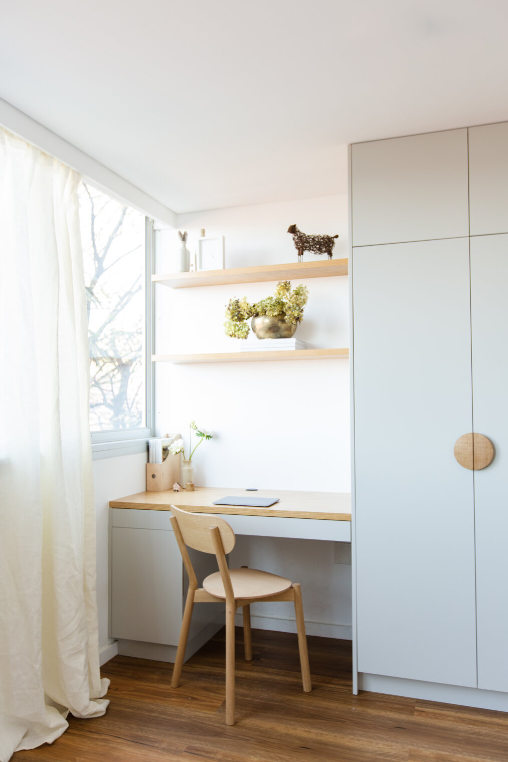
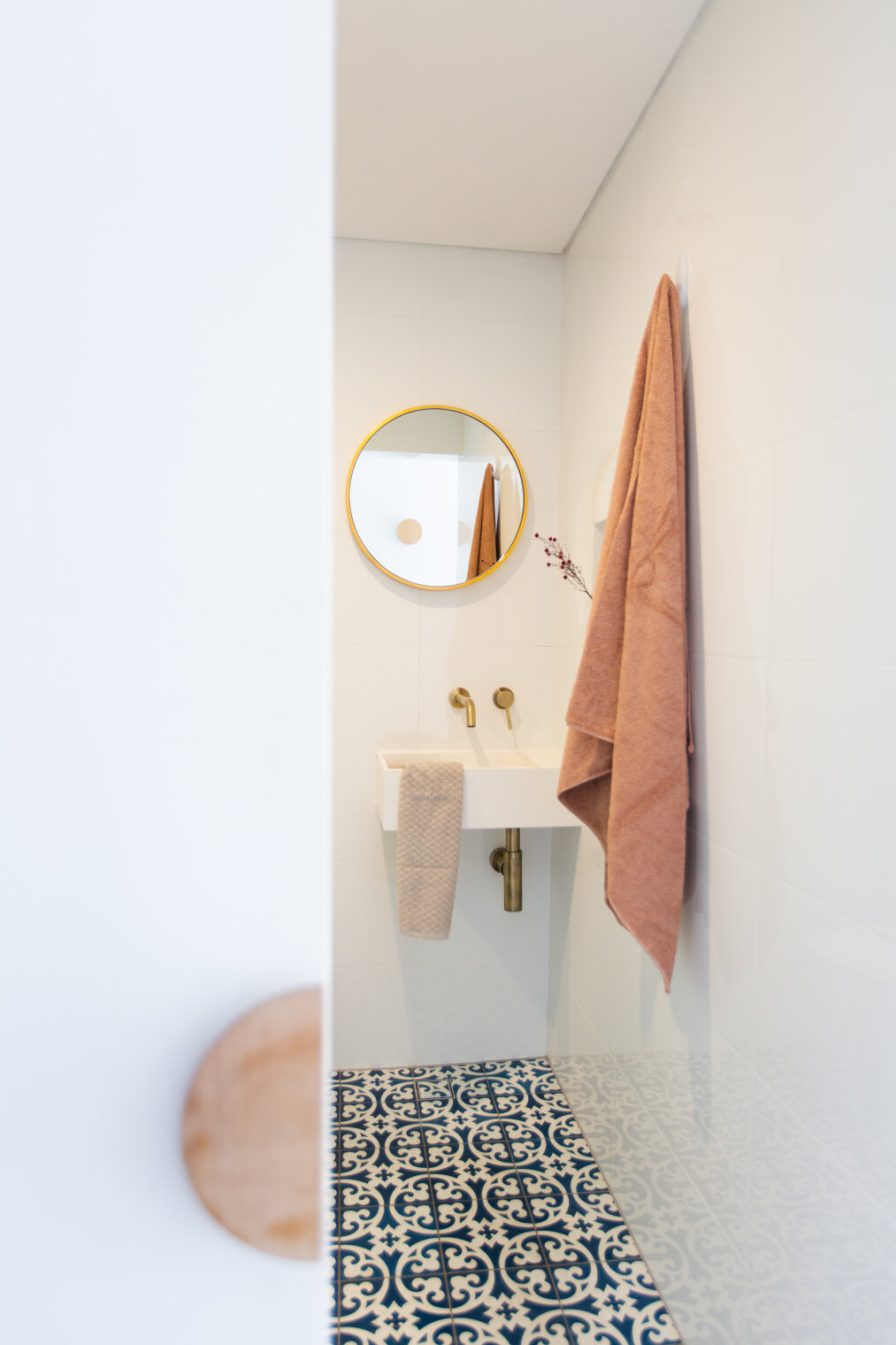
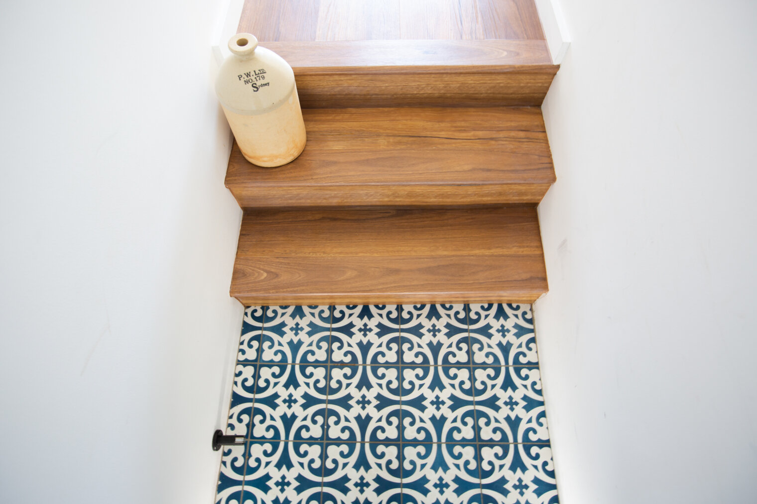
The Paddo Project was completed between February - August 2019 where I was asked to make the most of a small space to create a “light, bright and airy” space. This included some very careful planning with the joinery and making sure there was a place for everything. I have been told by my client Sarah that she loves coming home to it everyday.
As an interior designer that works predominately on the bigger picture of a renovation from spatial planning to material selection I don’t often get the opportunity to style the finer details in (except in my own home).
Planning for a photoshoot is something new to me and I daresay it took me a little longer than an experienced stylist but here is how I brought it together.
1. Concept
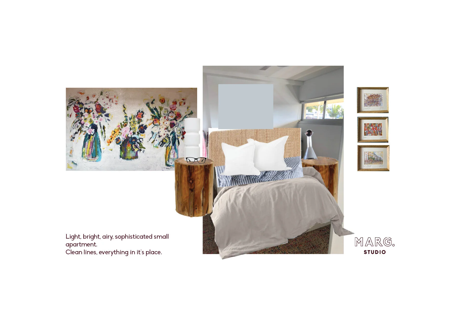
I wanted to emphasise the original concept to create a “light, bright and open” space in the photoshoot. I started to put together a few (rough) concept boards that brought together what I already knew was in the space and a few items that I wanted to use of my own.
I didn’t end up finishing these boards because I had enough of an idea of the direction I was going in. The below image is where I started with my plan for the space and gave me enough of a starting point to move on.
2. To do lists!
I started pulling together the styling pieces I had from home to visualise what pieces would go where in the apartment. Being in unfamiliar territory I also needed to draw the spaces out to make sure I had thought of everything and visualise some of the angles I imagined would be taken in the shoot.
Once the drawings and lists of all the items where complete I got a sense of the items I would either need to buy or chat to suppliers about borrowing. Most of the smaller styling items came from “shopping” at home for unique pieces that had a bit of a story or link to the concept I was creating. I ended up only buying a throw rug, a couple of towels and some hand soap (all of which went to very happy homes afterward).
3. Art
More recently I have been focussed on helping clients to select and install artworks that they will love for years not months while not breaking their budget I wanted to use this opportunity to demonstrate the installation of artworks in this project. Therefore a lot of my styling choices were influenced by the artwork I had selected which I think is also indicative of how styling in your own home can work.
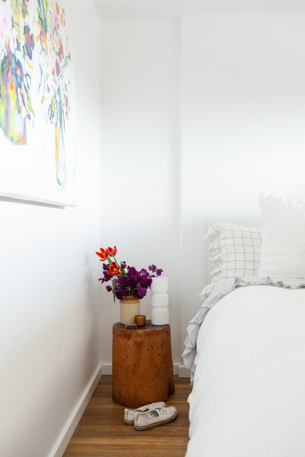
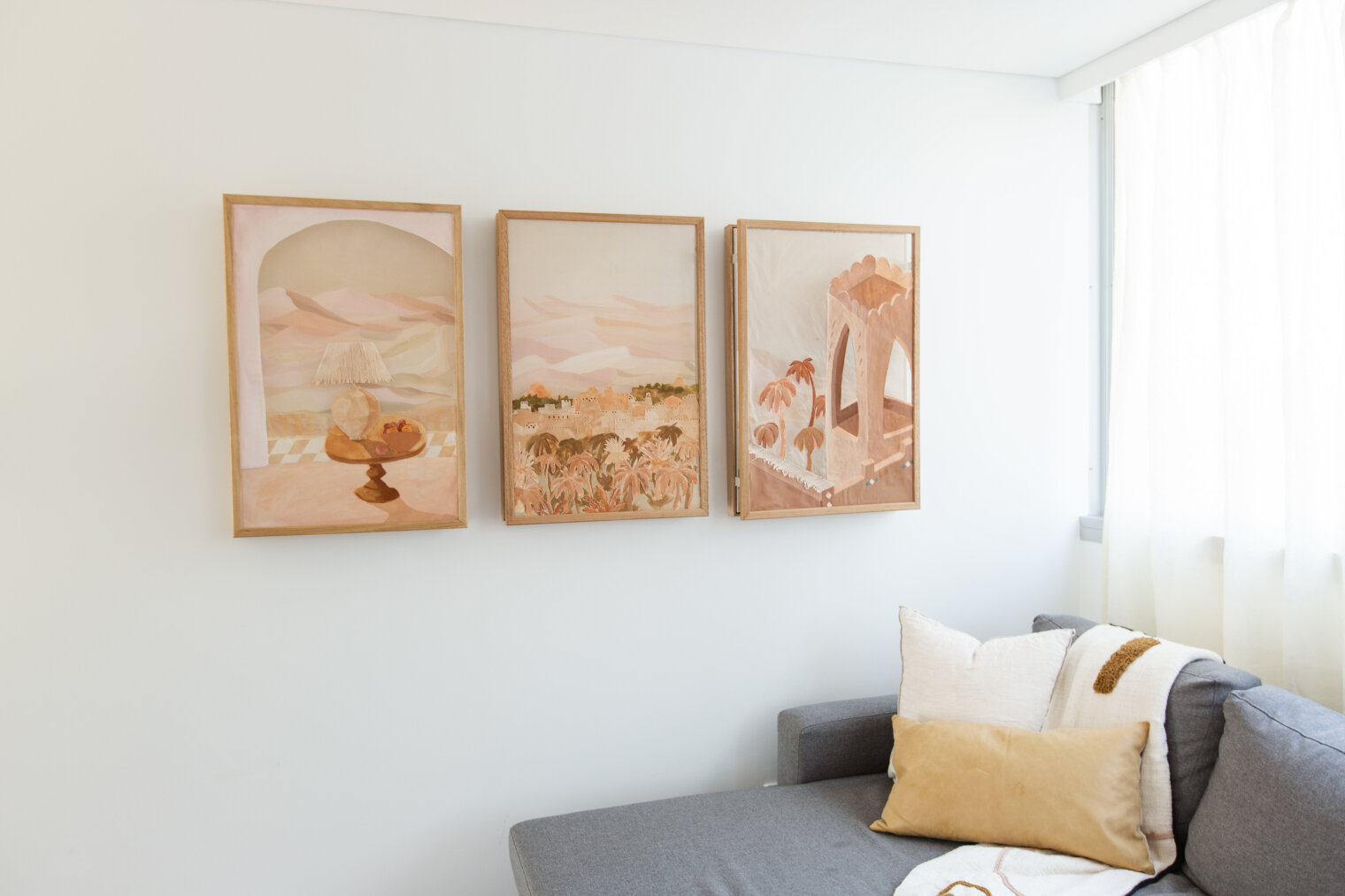
The feature artworks I chose for the Paddo Pad were: a Kez Brett painting, my own Evi O work (my very first adult artwork purchase from Saint Cloche Gallery), Erin Morgan’s Desert Series I commissioned as part of this process and an artwork my client had recently purchased from Greenhouse Interiors.
Each work added something different to each space and was chosen for the colours, subject and the size needed for the location. Being a small space I needed to make sure the art didn’t make the apartment feel smaller than it was so I focussed on a few bigger pieces rather than a lot of smaller ones. I also think it’s important to not fill every single wall in a home but balance the works to make the most of them.
Evie O, Tower #1 2015 bought from Saint Cloche gallery down the road from The Paddo Pad
4. Flowers
Flowers or plants always add a nice fresh touch to a space that I don’t think can be achieved by man made products. Luckily for me, I have a clever Mum who creates large floral installations for weddings and events who offered to come and be in house florist and assistant for the day.
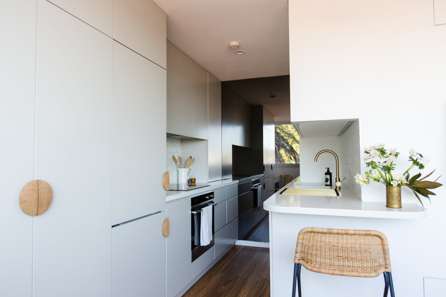
There was only really a few spots in the house that would work for a vase of flowers and the scale wasn’t massive. The starting point for the arrangement on the bench was a piece of trench art brought home from Egypt by my great-great aunt after WW1. The colour and shape of it worked in well with the project and also has depth of history that can’t really be achieved by buying something new.
WW1 bullet shell trench art + some Farm to Floral magic.
5. Photography
I engaged Sheri McMahon because her photography style best matched the “light, bright and airy” feeling I was looking for. Sheri has done a lot of work photographing weddings and in more recent times is shifting towards branding photography. Having a photographer you can collaborate with and bounce ideas off was so important on the day and I can’t wait to work with her again. Thanks Sheri.
6. Packing
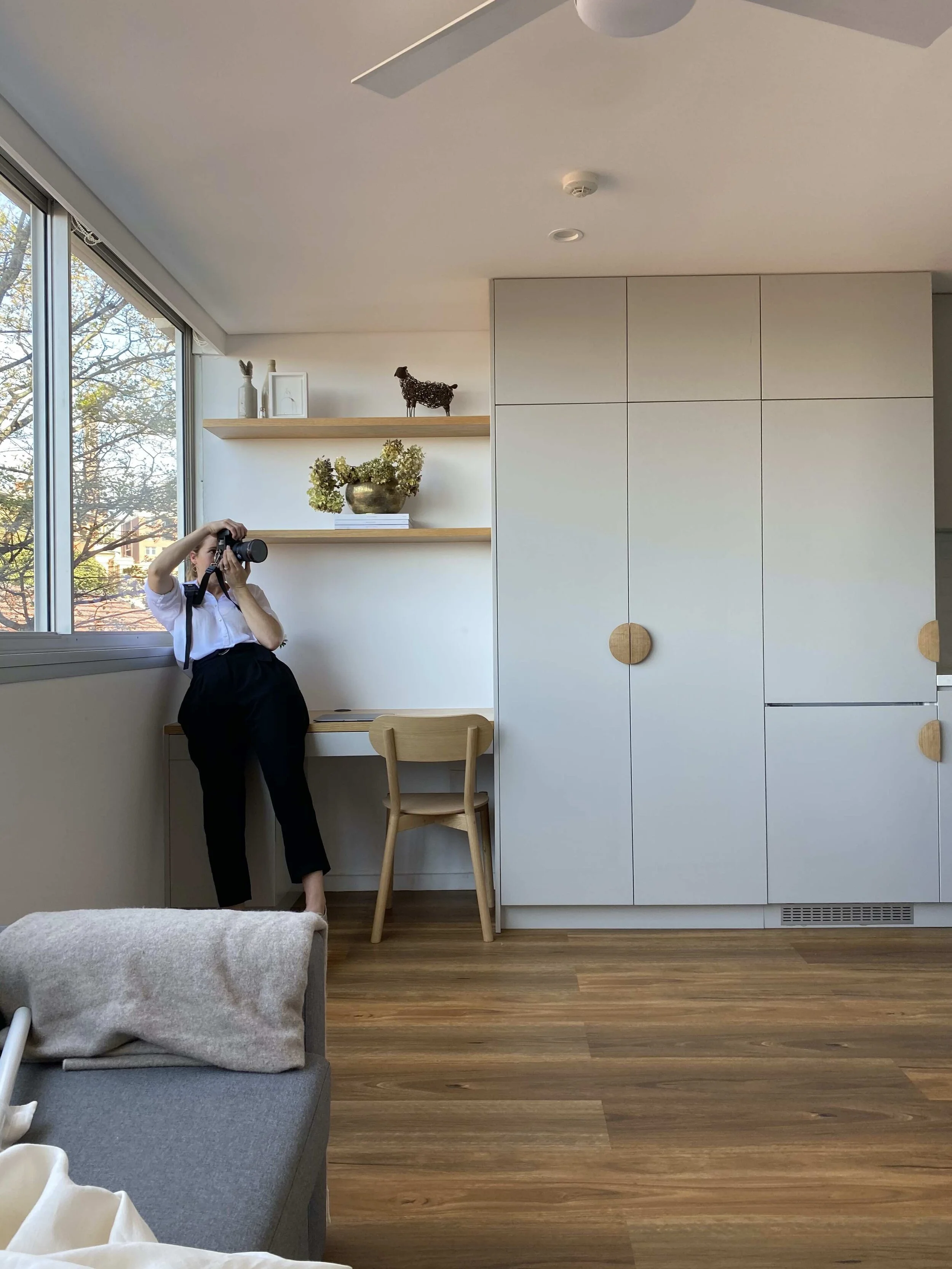
This is where all the infamous wrapping, lifting and packing work comes in. The boot of my car was packed to the brim and I had a curtain rod riding shotgun with me up front. Needless to say there was no room for passengers and my lovely assistant (my Mum) was in another car packed with the larger artwork and even the doona cover from her own bed!
Anything for “the shot” - Sheri McMahon Photography
7. Shoot day
I remember thinking before the day that I would try and take some videos for social media doing a tour through the finished styled space. Firstly, when did I think I would have time to do this? Secondly, while the image in front of the camera is so serene and lovely, behind the photographer are piles and piles of styling props. Not to mention the bathroom we had stacked to the roof of furniture while we photographed the rest of the apartment.
The mains things I learnt was that if you put together your initial concept, take the time to make a plan and pack (a few) back ups then the rest will fall into place on the go. I also learnt the hard way not to lock the deadlock on someone else’s apartment unless you know you have the keys!
This photoshoot marks the very first MARG. Studio project to be photographed and I couldn’t have done it without the trust of my client Sarah, the photography skill of Sheri and of course the flower wizardry of Farm to Floral. Thanks team!
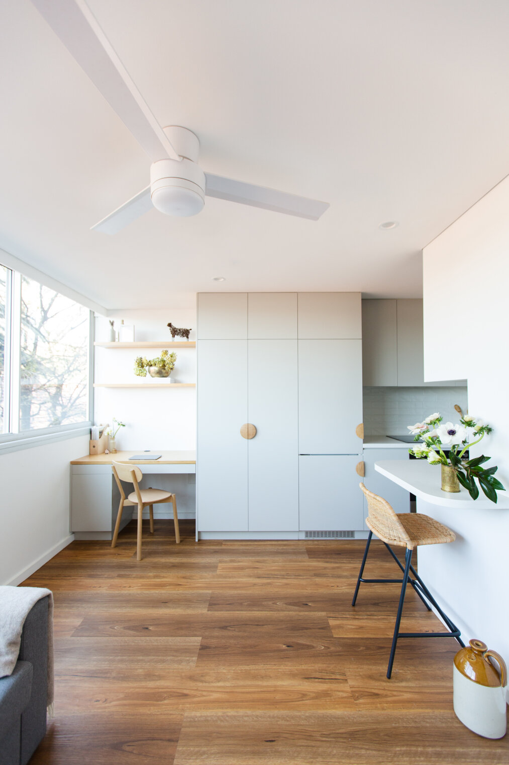
The finished product!! Simple as…

